Tuesday, 2 November 2010

Filming Schedule

We came up with a plan of when all 3 of us were available to film our music video.
As we all had to work around other lessons and commitments outside of college.


Thursday, 21 October 2010

Wednesday, 20 October 2010

Anamatic

Risk Assesment

For health and safety reasons our group came up with some ideas
to reduce any risks whilst filming :

Possible Risks
1. Trailing wires
2. Slippery floor
3. Possible over-heated machinery
4. Sharp objects on the floor when walking around in bare feet
5. Broken equipment
6.Unavailable actors

How we could solve them?
1.Cable ties and covers
2. Make sure set is well prepared
3. Set up regular ventilation
4. To make sure the floor has been safely checked
5. Replace any broken equipment or try and solve the problem or find away around it.
6. The main actors in our video are ourselves to we need to make sure that we are all defiantly
available to film when planned.

Thursday, 7 October 2010

Test Shots Of my artist logo.


These are some sample Text fonts we were trying out to see which one looked best for our digipak and advert.

Tuesday, 21 September 2010

Assesment 5 - Call Sheet.

Assesment 4 - Treatment Sheet.


Background of the song : Acceptable in the 80s" is a 2007 song by electronic musician Calvin Harris The video is about the style and culture of the 1980s.

The music video follows typical conventions of the 80's, it includes a lot of bright colours and big hairstyles which were high in fashion during this time. The video also contains 2 scientists testing on an animal which may think to the fact animal testing was 'acceptable in the 80's' which is is not today.

Acceptable in the 80's was released in 2006 on maxi single, the same year it was recorded and on the 12th of march 2007 in the UK and March 15th in the USA. The song became Calvin's first hit in th
e UK as it went to number 10 in the UK singles chart. The radio edit was 3.31 seconds long and the recording label was Sony/Columbia. Other songs released by Calvin Harris during 2007 were 'Vegas' and 'The Girls'. All of these songs were released as part of Calvin's first album 'I Created Disco'. The album title links with the genre as music as it can sometimes be described as 'Disco' or 'Dance'.


The music Video : Our music video's overall style is edgy with strong bold colours using costume and music to portray this. We are going to dress ourselves up to look like the 80's icons, including madonna and blondie this allows us to continue to relate back to the song title. Each costume and make-up will relate back to their over the top personalities. The focal point of bold colours and prints is aimed to capture our audiences attention. We intend to use keyboards and headphones as part of our props, and relate this to the beat and timing of the music, making our video to a more professional standard and will appeal to our target audience. We are hoping to find somewhere with a plain white background to shoot our video for particular scenes as our bold bright 80's style music and costume would contrast against the plain minimalist background. We hope to use the 'WE LOVE 80'S' throughout as this is relating back to the theme of the song making it more realistic. For our performance we are a group of three girls and as the artist we have chosen, 'Calvin Harris' is a male artist we thought it was extremely relevant that we added a male actor to play his part. We are only adding one actor, minus ourselves as we felt this would minimalise complications and make our product easier to film.

Some of the ideas which we have finalized include:
'I've got love for you, if you were born in the 80's, the 80's' - For this lyric our initial ideas where to include a mixture of medium, close-up and long shots all connecting vertically together this will give our audience a sense of illusion and make them want to watch on.


Lyric Breakdown.

Intro (0.00-0.31)
It was acceptable in the 80's (0.31-0.37)
It was acceptable at the time (0.39-0.44)
It was acceptable in the 80's (0.46-0.52)
It was acceptable at the time (0.54-0.59)

I've got love for you (1.00-1.02)
If you were born in the 80's, the 80's (1.02-1.07)
I've got hugs for you (1.08-1.10)
If you were born in the 80's, the 80's (1.10-1.14)

I'll do things for you (1.15-1.17)
If you were born in the 80's, the 80's (1.17-1.22)
I've got hugs for you (1.23-1.26)
If you were born in the 80's (1.26-1.29)
Yeah (1.29-1.30)

It was acceptable in the 80's (1.33-1.39)
It was acceptable at the time (1.40-1.46)
It was acceptable in the 80's (1.48-1.54)
It was acceptable at the time (1.55-2.00)

Instrumental (2.00-2.16)

I've got love for you (2.17-1.18)
If you were born in the 80's, the 80's (2.18-2.23)
I've got hugs for you (2.24-2.26)
If you were born in the 80's, the 80's (2.26-2.30)

I'll do things for you (2.32-2.33)
If you were born in the 80's, the 80's (2.33-2.38)
I've got hugs for you (2.39-2.41)
If you were born in the 80's (2.41-2.44)
Yeah (2.44-2.45)

It was acceptable in the 80's (2.48-2.54))
It was acceptable at the time (2.55-3.01)
It was acceptable in the 80's (3.03-3.09)
It was acceptable at the time (3.10-3.15)

Instrumental (3.15-3.32)
Finish

Thursday, 16 September 2010

My Song Choice

Calvin Harris - It Was Acceptable In The 8o's.

Primary Research Questionaire


1.How old are you?
-Under 16
-16 - 18
-18 +

The majority of people who answered the questionnaires had the average age of 16 - 18, as those are the age of people who attend the college or in the late stages
of school.
2.Gender: male or female?
-50/50

When collecting research we made sure that there was a mixture of both genders so we could establish fully what gender would prefer the specific genres of music. We asked 10 males and 10 females.


3.Occupation:
-school
-college studying as/a levels
-apprenticeship
-full time job
-unemployed

Through researching the occupation of our target audience we found that more than half were at college studying A/AS levels at college.


4. What do you do in your spare time?
-Cinemas
-Listening to music
-Reading
-Revising
-Shopping


There where a range of different activities that we found when researching, although listening to music we found had the highest amount. This allows us to be able to ask further questions in more detail and help us towards the end result.


5. Favourite genre of music?
-POP
-HIP HOP
-INDIE
-R&B
-ROCK
-CLASSICAL
-OTHER

We found that POP was the favourite type of music genre amongst our target audience.


6. Do you think that the music video is important to every song?
-YES/NO

Almost all said that the music video was important for the song to be a success, as they felt it made the song stand out more.


7. What key features do you feel allows the video to stand out?
PROPS?
COSTUMES?
MAKE-UP?
LIGHTING?
LOCATION/SETTING?
ALL?

the majority of our audience felt that all features were as important as each other as they all contribute to the overall factor of the music video ensuring it is visually pleasing.


8.How often do you listen to music?
-DAILY?
-WEEKLY?
-MONTHLY?

We found that after looking at all our results that they listen to music all the time and they listen to it a few hours everyday at least.


Permission Request

Here is the evidence showing my message to Calvin Harris, i requested to be able to use his song 'Acceptable in the 80's for my music video.


Genre & Convention Research

We have chosen the song 'Acceptable in the 80's by Calvin Harris. The genre of Calvin's music would often be classed as Electropop, Electro house or Nu-Disco. It is usually quite upbeat and quick paced. Typical Instruments used are usually Synthesizer, Vocals, Drum machine, Tape loops, Drums, Guitar, Keyboard. Typical conventions videos of this genre use are bright colours and flashing lights. The images in the videos usually match the beats of the song. They usually include dancing as the music is quite quick and sometimes classed as 'Dance Music'.
An example of this would be the artist example.


Audience Profile

Development Of Initial Ideas.


Our chosen target audience would about around 15 to 24, which would be around the age of students. I am judging the age rage on the genre of music I am itending to use for my video; Electro pop/Dance. Ideas for our video includes using bright colours and 80's themed costumes and make up. We also had the idea of having 80's icon references through out the video. For example people like Madonna and Blondie. If possible we were going to try and use clever lighting to match the beat of the song.

Magazine Advertisement Deconstruction.


For my magazine advertisement deconstruction i used Jay-z's Album 'The Blueprint 3' released in 2009. The advert is very minimalistic to not over-do the advertisement. This is becuase Jay-Z is a well known rap artist worldwide and does not need to use bright bold colours and abstract features on his advertisement for people to notice. The audience recognise the name not the image of Jay-Z. There will be huge fan-bases world wide who are already going to buy the album no matter what is represented on the advertisement.
The colours used are just plain and simplistic and Grey colour which is a sky background which contrasts against the black bold writing in upper case lettering. The advertisement also consists of the what the album is going to feature and this is centre of the page showing that this is high priority information for the audience. This also consists of the date of which the album is to be released 'September 14th 2009' in a more dominant text to grab the audiences' attention because of course that is when the album is on sale for the fans. This magazine advertisement tells the audience that Jay-Z is already a successful raper and has created an image in his own right for the fans to easily acknowledge and admire.

Thursday, 1 July 2010

9 Screen Shots Of music video.

Ellie Goulding- Guns & Horses.

0.2

The first shot of a white horse in an unidentified area with a surrounding of mist and looking like its dawn in the back ground of the shot. It is a medium shot of the horse who is not using direct mode of address. The horse is the main image in the foreground with tree's and branches in the background in low priority. With dark lighting and low key colours used in this shot.

0.5

the second shot is of a body lying on the ground in the same scenario as the last shot. A mystical figure of a body all dressed in a white uniform representing a soldier figure. The steam and mist gives the shot a feel of fear of the unknown with it sort of like a horror film.

1.03
The next shot is a girl in the same uniform a soldier/military vibe. With a red curtain in the background contrasting against her white clothing with the red detail. The female in this shot has pale make-up with dark round eyes and is using direct mode of address. A long shot has been used and more light is used in the image of the female than around the rest of the shot with dark corners used.
1.11
Ellie Goulding the singer is now appeared in the video. With this shot showing her in casual clothing in a forest scenery with a long shot of Ellie the main singer being used. Their is an usual sense of light in this shot as it is a natural source being used coming from the sun and directly on Ellie.

1.43
In this frame the female figure in white military uniform is holding up a Sword in the dark misty forest as if in the war.

1.58
Ellie goulding is singing not using direct mode of address with her hair just wavy and minimal make-up representing a normal female of her age, still in casual clothing. She is showing natrual beuty in a natural enviroment. As the shots go on the background is getting lighter because of the sun rising and is getting less mistier.

2.16
The bright colourful flowers contrast in this frame against the dark green's of the woods. Using a long shot to show the image of several flowers growing in a shape together.

2.40
The last frame in the 9 frames i chosen shows Ellie singing at the camera now in the day light. Looking as if she has been united with the horse and the female figure from the last shots among with other soldiers with weapons such as riffles. She is now stood centre on the flag that was in the background of an earlier shot showing that she has now maintained priority and is now the most important figure in the video, as she is the lead singer.


Tuesday, 29 June 2010

LipSyncTask.
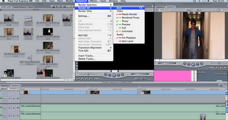

We used the program Final Cut Express to do a lip syncing task.


The print screens of the different settings and techniques we used to edit our music video to create an overall visually pleasing final piece. It was important throughout that we kept rendering the product for us to make sure the lip sync looked accurate and was in time with the original soundtrack. Aswell to get the right shots of the music video we used the in and out marker tools. After choosing the selection i wanted to use i dragged it onto the timeline and tried to ensure the timing was correct throughout.


The final Lip sync task.


MusicVideoAnaylsis

Florence + The Machine. Rabbit Heart.


For the duration of this video i counted approximately 97 shots. At the start there was less shots to begin with as the song was slower and the video was focusing on the main artist.
Then as the chorus began and the song picked up space there was lots more shots and they became faster in joint with the speed of the music. The music video has an old fashioned roman/greek theme that makes it more surreal. where the music then turns light hearted and the pace slows down the shots in the video turn to a more paler colour and the sunshine reflects off the camera and there's also 2 transparent shots over one another showing 2 shots at once.


Tuesday, 22 June 2010

Mika's Album.


This is Mikas debut album so it ha h is name in uppercase big abstract font right in the centre of the album in white which contrasts against the bright colours in the background. The name of the album cover is also featured on the front cover to appeal to the audience. The bright patterns and images such as the flowers and the doves is what makes the album unique and would stand out from the others. The album comes across as a really fun natured album.
The piano featured on the front of the album could relate to the fact of Mika being an authentic musician. The title of the album relates to what is featured on the front of the album. Mika's album names ' Life in cartoon motion' relates to the colourful animated cartoon sofas and cogs'.

Album Covers Analysis.


The 'Kanye West - Graduation' album shows a 'Parental Advisory' certificate on the front of the cover which shows although the layout on the cover is light-hearted and colourful with animated characters on it the album actually contains explicit content which is shown through the certificate. The Beatles Album ' Yellow Submarine' consists of a psychedelic theme which relates to the type of music they made in the 60's. The Paulo Nutini album is his second album and consists of a different type of music to his first album that he made. The album relates to him turning over a new leaf and recording a new type of music and to try and establish himself as a new type of artist.


Tuesday, 25 May 2010

Warhol Image 2.
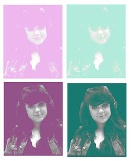

I decided to try out a different style of the work by Warhol, as i felt this would add more variety to my work. To create this effect, I originally took an image on photobooth and dragged it into photoshop elements. i first used the magnetic lasso tool, to select my chosen area within the image. I then went to the toolbar at the top and selected image - mode - grayscale. I later selected the layer adjustment tool and went down to brightness and contrast. I changed the brightness of my image to +25 & changed the contrast too +55. Next, i went to image - mode - RGB and duplicated the image. Using the duplicated image, i changed it to soft light to try and make my image more visually pleasing. i created a new layer on top of the layer which i had duplicated and i then filled it with colour. using the same settings as previous i selected the colour layer and selected lighten. i repeated this style of Warhol image to create this overall effect, i believe it has worked well and showed the style which i wanted to portray.


Warhol.


To create the 'Marilyn' image of myself, i cut took a photo of myself on photo-booth and dragged it into Photoshop Elements. I then had to use the magnetic laser tool to cut out my main shape of my head and shoulders and then copy the image onto a new layer.
Then for the blur affect i used the smart blur tool on the filter and set the radius to around 40.
Next i used the filter > Artistic > Cutout and set the levels to 4. After that i adjusted the brightness and contrast settings to increase the contrast level on my Warhol image. .